


Pixar's Inside Out (Pete Doctor 2015)
Even pixar kids need to get the blues
The images of Pixar are familiar: everywhere, heavily advertised, with game and toy offshoots, and nearly every year for twenty years another big new one. They are computer animated and don't try to look hand drawn or naturalistic, content to resemble puffy plastic dolls. They are not ironic about this, like the Warner Brothers Lego Movie or the Belgian stop-motion animation A Town Called Panic. These films had a more sophisticated appeal because of their direct reference to their own artificiality. In Inside Out, the little girl protagonist is seen a couple times up close looking like a "real" girl, but it's a throwaway. Perhaps the puffy plastic is deemed more reassuring.
Sometimes Pixar movies present a well-realized world, such as the French restaurant of Ratatouille, the dystopian present and more dystopian future in WALL-E. But often they get so involved in something or other the artificiality doesn't matter, or becomes the thing. Inside Out is about psychology, or morality, or morale. Most of its action takes place "inside," in a notional unseen world of personified humors, moods, or mental elements, mainly as they appear in the head and heart of a ten-year-old girl called Riley. We see her transplanted from her original Minnesota home, friends, and girls hockey team by her parents, who move to San Francisco (the show-home of Pixar, which is located in Emeryville, California, across the Bay). This is for her father's job, presumably a "start-up," though details, filtered through Riley, are vague.
The movie is a better-than-average Pixar product, and pretty original, though it's sort of a throwback to things like comedies of humours and morality plays (being a throwback not being a bad thing, but better if done knowledgeably). This is a film for kids, even if parts of it go over their heads. It also draws, if feebly, on Freudian psychology. Its dreams are candy-coated -- or toned in pretty blue for cuddly sadness. Its message is a key bit of psychobabble: we have to feel our feelings. We have to feel our sadness in order to move on to something new. Riley gives up taking a Greyhound bus back to Minnesota on her own and just tells her mom and dad she misses "home." "We miss home too," says her dad. Mom and dad and Riley all hug, and she can get her spirit back and join a new, San Francisco, hockey team at eleven, and face the mystery of puberty.
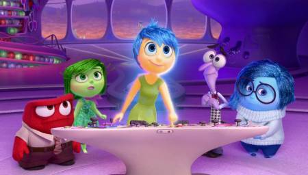
Everyone, in Inside Out, has his or her butch or femme console of directors. They comprise Joy, Sadness, Fear, Anger, Disgust. And there is other stuff, lots, in fact. There is an Imaginary Friend, who for a while plays a key role in trying to save Riley from despair over the move to San Francisco. (You have to hand it to the Pixar folks: they are content to make San Francisco, the shimmering City by the Bay, look like a pretty grim place, as it looks to Riley in her early days there.) There is a Hollywood studio in Riley's head that produces her dreams (huge missed irony op there). There is a section for Abstract Thought. There is the Unconscious, where "the bad things hide." And there are mazes and mazes of high wall files of glowing cubic temporary and permanent memories. For some reason Joy seems to be in charge, and she bustles about, making sure days are good and (positive) memories are preserved. But Sadness, a frumpy, plump, blue-colored, but rather sweet young woman, has an important role to play that will be realized later.
Like Toy Story and so many other animations, Inside Out occupies a lot of its time with a mad chase whose purpose we are in dire danger of forgetting along the way. In it Joy, Sorrow, and the Imaginary Friend collaborate in negotiating complicated, nightmarish landscapes and obstacles trying to catch a notional train back to somewhere so they can save Riley from -- what? Perhaps herself. Or this is Joy's aim, till she has the aperçu that embracing Sadness can be the essential stepping stone to new. . . Joy. Riley learns to accept her sadness and express it to her mom and dad, and her mom and dad learn the important lesson that when their child is sad or angry it's an important indicator of things going on that she needs to share.
This does resemble the old dramas of the "humours," which grew out of an ancient system of psychology of four personality types based on body liquids, of which there were imagined also to be four: blood (sanguine), phlegm (plegmatic) yellow bile (choleric), and black bile (melancholy). The sanguine person would be gregarious, hopeful, chatty, and upbeat -- like Joy here, though Joy lacks some of the nuances, being mainly just a nervously manipulative type, focused only on Riley having good days. The plegmatic personality may be the most complex one, since it comprises inwardness, contemplation, reserve, but also patience, tolerance, and more. We realize that Pixar's plumping for "Disgust," "Fear," and "Anger" means they're focused on quick reactions rather than the subtleties of human behavior. They see us as in danger of being repelled, running away, flying off the handle, or bursting into tears. In modern terms Inside Out might relate to the concept of "cognitive therapy," which teaches that we can recognize our feelings as they arise and realize they are not us, and can be changed (or perhaps waited out). And Inside Out's subtlest messages may be about the complexities of having to relinquish childhood memories in order to grow up, and parents having to allow that.
The contrarian critic Armond White is right when he says in National Review that the American media are excessive in worshipping Pixar projects, but that this one is "not so bad." For a child, and for some adults, its mechanistic interpretation of psychology may be useful. It will be a new child mythology, though any good hand-illustrated children's book is worth a half dozen Pixar movies, and anything hand-animated or stop-motion would look better. Mr. White is also right in saying, in the same review, that when his idol Stephen Spielberg doesn't direct the Spielberg film, it's rarely much good. This true of the new Jurassic one.
Inside Out, 94 mins., debuted at Cannes May 2015; half a dozen other festivals; opening theatrically from mid-June all over, US release 19 June, UK 24 July.

 Reply With Quote

Bookmarks